Print Research
Research:

1) The 12 Key Conventions of the 'above' BFI festival programme cover:
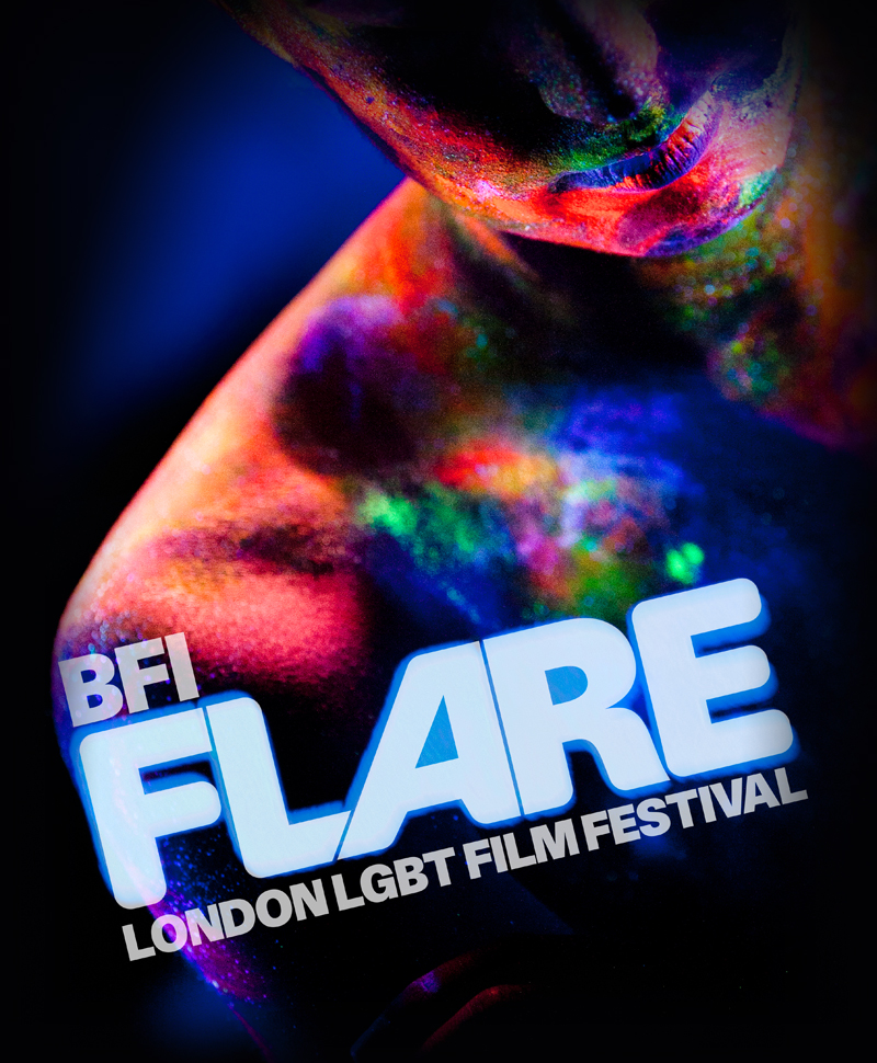
- Title of publication- The title of the programme/booklet cover is clearly see visible in a thick and large font size.
- Central Image- The central image isn't as visible as intended. The central image is seen behind the text ad is somewhat transparent through the text. The image visible is of a persons face which takes up the space of the text, so that there is no 'white' spaces visible.
- Colour Scheme- The colour scheme used in this programme booklet is mostly of the 'persons face'. The persons face seems to give off a variety of colours drawing the consumers attention to both the text and the picture. Other colours visible in this programme cover is black. This colour is seen to be used primarily for the central colours (of the persons face' to grab the attention the most- to make the background colour look insignificant.
- Language- There is text written on the front page of the cover and is written in English language e.g. of text 'in partnership with'.
2) Examples seen in other film brochures:

This film brochure has a running theme present on the pages. I like the way that the theme of wheels and colour patterns are consistent to the cover page. Moreover, the use of having the writing structured in the way it is conveyed in the image above is a very nice representation of the way I may like to use for my own programme.

I really like the use of an image to be placed ion the front cover. The way that the image above has used the idea of a 'film strip' as the main attraction for viewers to see fits nicely with what the programme is about- film. I could use the idea of having the film strip as the main image on my cover, however instead of having random images on them (like the image above) I will put a picture of everyone's (from my class) film as a feature for the programme.
One thing that I will take from this cover is the use of different colours. The use of different colours doesn't make the cover look unattractive. I was a bit concerned with the level of colours that I wanted to use for my programme colour, however this BFI programme festival cover clearly shows how such variety of colours can look appealing.
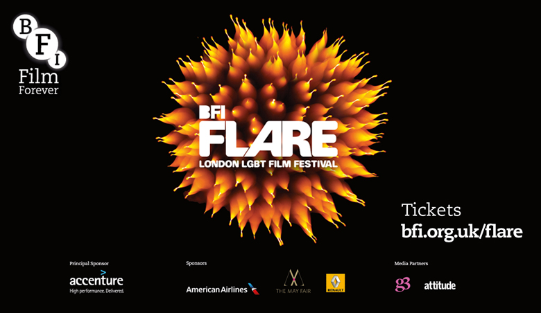
One thing that I like from this cover (from a BFI film brochure) is the use of having partnerships labelled at the bottom of the cover page. As you can see from the bottom of this cover, there is a large amount of partners as well as associates that are linked with the BFI. I could implement this idea into my own work as I could place small names and logos of companies that are linked or helped with 'The Little Picture House'. Moreover, I really like the font in which the word 'Flare' is written in. I wanted to use standard font e.g. calabri or ariel, but this cover page shows how different fonts can look really pleasing and attractive on the front page and would love to implement this in my own work.
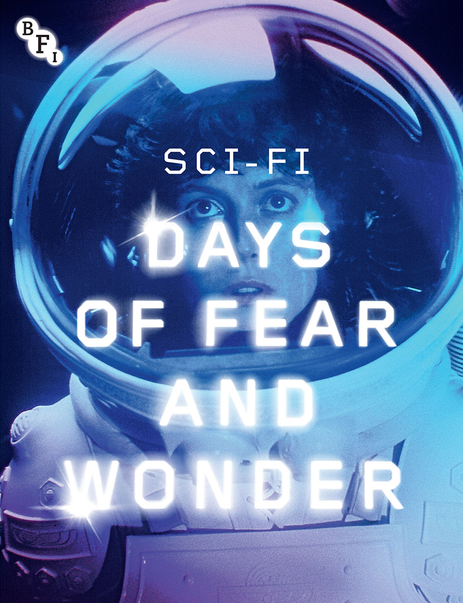
Finally, one thing that I will take on board when designing my own programme cover for The Little Picture House is the use of having a 'possible' central image. The way that this cover has portrayed the 'space women' in the front cover can be very useful as I can feature a character from my film as a replacement. Moreover, I really like the special effects used in the editing of this cover page. The text is designed to match the theme of space as the text has stars in them. In addition, the use of bright colours really contrasted the tone of which the cover was delivering; the theme of space.
3) Five contents page that would come in great use for your own contents page:
One thing that I will definitely take into consideration is the use of the 3 step rule. This contents page delivers a great example of both what I want to create (in terms of structure), as well as aesthetics. This cover page really delivers on the portrayal and use of the three step rule (the division of the page into three). This contents page can help me identify how to structure the contents page such as, where to place the pictures/images or text.

One reason why this contents page really captures my attention is the use of featuring other films. In my contents page I would like to feature one image from each group (in my class) and feature them in my contents page. This is very useful because when a reader views a contents page, the y would like to know what other sources of entertainment are on offer and I would like to deliver this to the reader.

I really like the use of small portion of text on the contents page. Everything is condensed in to what the reader 'must' know and not throwing too much information at them. I can use brief descriptions (including images) of each film on the contents page with a brief description of what each film is about. Furthermore, I like the use of a background image on the contents page as I would not like to have a plain background on mine as it will make the contents look uninteresting.

This contents page is full of unique ideas and creativity that is used in a very different way to what I expect.First of all, this contents page is filled with many pictures and acts like a collage of some sort which makes it all the more interesting and beautiful. This creative contents page can be used as a way to grab the readers attention due to the many images on the page and of how beautiful its appearance is. In addition, the use of having the text slanted along side the collaged images makes it more effective as it forces the reader to tilt the book and engage in what is being presented.

Finally, this contents page has a very unique style in the way it presents its words and images. The images have been put along side the text but has been positioned in a slanted way, so that the main focus is on the text rather than the images. My intention for the contents page is for there to be images, but not to be the prime focus as the text is the most important part to the reader.
Planning and Sketching:
1)

3)
4)
No comments:
Post a Comment