Tuesday 26 January 2016

Tsotsi Film Review

Tsotsi Review

Camera movement:

I really like the way in which the opening scene starts. It starts off with the characters playing a dice game and shows little glimpses of it taking place. These shots were used to engage the audience into what is going to happen next and who are these characters playing. There were a lot of steadicam shots of Tstsi as he is walking (normally in the centre) and the camera focuses primarily on his facial expression and this convey the audience the feelings in which the character feels.

Dialogue:

The dialogue used was of a foreign African language which was hard to understand although there was subtitles at the bottom. This was because the characters would speak long sentences and it would be difficult to keep up with the pace of reading while the scene transitions (not giving the audience time to understand what the character had just said).

Music/Soundtrack:

The song choice used fits very well with the scene as well as filming general. The films is set around a black ethnic gangster group and the music choice is of African music which is parallel to the characters as well as to the scene. The songs were non-diegetic as the characters within the film can not hear the song playing in their world.

Sequences:

One of the best scenes through out the film was the opening scene of when the gang squad move from their hut to the train station. One reason why I like this sequence was because the establishing shots as well as the shots of the street members were done really well. In addition, the song choice really helped deliver the tone of power and dominance through the main characters (Tsotsi) movements as he walk's with his crew down the urban area.

Overall opinion:

I think that the general plot line was told very well and didn't seem to turn away my attention. Moreover, the actors portrayal of these characters really help deliver the sympathetic element from the audience and helps the audience to interact with this character through the acting the actors have done. Acting plays a key part in film as it helps the audience to understand the type of character he/she is and possible links with the storyline as well as audience relation. 

Wednesday 20 January 2016

Mest 2- Progress Report

Progress Report

  • Work completed since 6 January
      1. Existing Product Research- 5 arthouse films. (Status: completed)
      2. BBFC Research- How films are rated and what do they do. (Status: completed)
      3. Focus Group Write up- Written version of focus group and feedback that was given during the focus group that can be implemented in to our film. (Status: completed)  
      4. Target Audience- The demographic that the film will aim to target. (Status: completed)
      5. Storyboard- Brief appearance as to what the scene will look like. (Status: completed)
      6. Shot list- All shots that are going to be used when filming.
      7. Institution Task- Arthouse film industry and the independent film production. 
      8. Film Pitch- A brief layout of the many factors that create the final product e.g. 30 minute narrative and 3 minute sequence.
  • Any incomplete pre-production tasks

  • The film schedule needs to be completed.


  • Next steps/Action plan
    1. Begin filming the actual film- Exposure
    2. Complete and finalise the schedule
    3. Complete the print research as well as the drawing stages. 
  • Date filming will be complete

  • The filming will planned to be completed in 10 days. (starting on the 20th).  

    • Requirements for photoshoot next week
    1. Suit (navy blue)
    2. T-shirt (black)
    3. Watch
    4. Tie
    5. Shirt (back-up prop)


    Wednesday 13 January 2016

    Mest 2 Print Research

    Print Research

    Research:


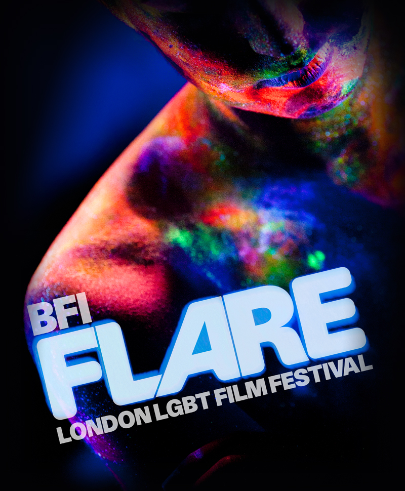
    1) The 12 Key Conventions of the 'above' BFI festival programme cover:

    • Title of publication- The title of the programme/booklet cover is clearly see visible in a thick and large font size.
    • Central Image- The central image isn't as visible as intended. The central image is seen behind the text ad is somewhat transparent through the text. The image visible is of a persons face which takes up the space of the text, so that there is no 'white' spaces visible.
    • Colour Scheme- The colour scheme used in this programme booklet is mostly of the 'persons face'. The persons face seems to give off a variety of colours drawing the consumers attention to both the text and the picture. Other colours visible in this programme cover is black. This colour is seen to be used primarily for the central colours (of the persons face' to grab the attention the most- to make the background colour look insignificant. 
    • Language- There is text written on the front page of the cover and is written in English language e.g. of text 'in partnership with'.
    2) Examples seen in other film brochures:

                                                
    This film brochure has a running theme present on the pages. I like the way that the theme of wheels and colour patterns are consistent to the cover page. Moreover, the use of having the writing structured in the way it is conveyed in the image above is a very nice representation of the way I may like to use for my own programme. 


    I really like the use of an image to be placed ion the front cover. The way that the image above has used the idea of a 'film strip' as the main attraction for viewers to see fits nicely with what the programme is about- film. I could use the idea of having the film strip as the main image on my cover, however instead of having random images on them (like the image above) I will put a picture of everyone's (from my class) film as a feature for the programme.


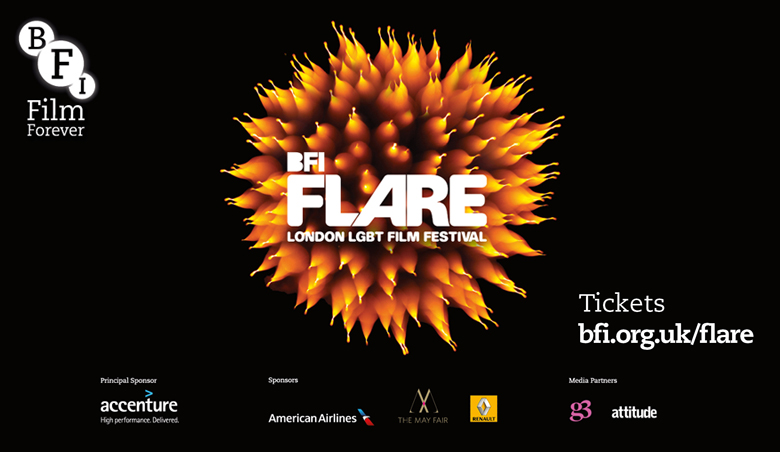
    One thing that I will take from this cover is the use of different colours. The use of different colours doesn't make the cover look unattractive. I was a bit concerned with the level of colours that I wanted to use for my programme colour, however this BFI programme festival cover clearly shows how such variety of colours can look appealing.

                                         
    One thing that I like from this cover (from a BFI film brochure) is the use of having partnerships labelled at the bottom of the cover page. As you can see from the bottom of this cover, there is a large amount of partners as well as associates that are linked with the BFI. I could implement this idea into my own work as I could  place small names and logos of companies that are linked or helped with 'The Little Picture House'. Moreover, I really like the font in which the word 'Flare' is written in. I wanted to use standard font e.g. calabri or ariel, but this cover page shows how different fonts can look really pleasing and attractive on the front page and would love to implement this in my own work.


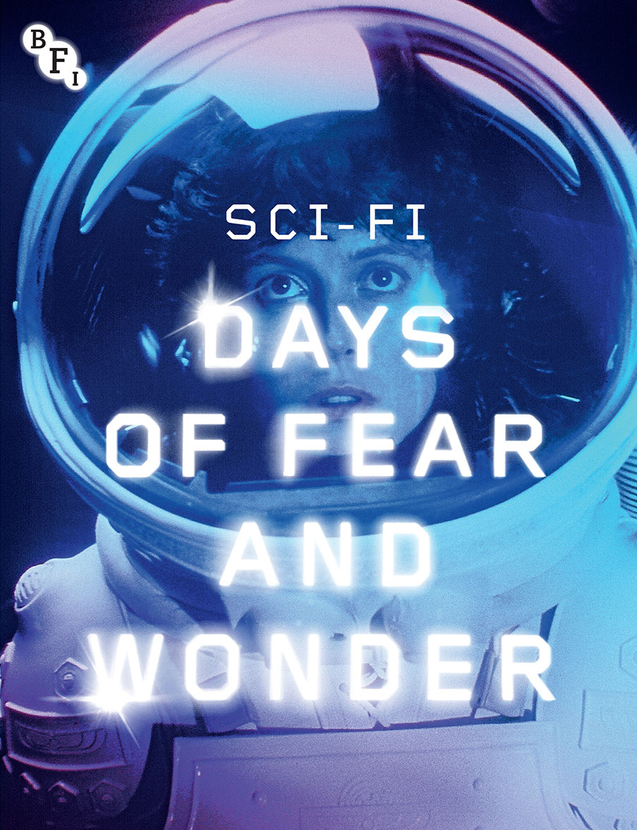
    Finally, one thing that I will take on board when designing my own programme cover for The Little Picture House is the use of having a 'possible' central image. The way that this cover has portrayed the 'space women' in the front cover can be very useful as I can feature a character from my film as a replacement. Moreover, I really like the special effects used in the editing of this cover page. The text  is designed to match the theme of space as the text has stars in them. In addition, the use of bright colours really contrasted the tone of which the cover was delivering; the theme of space.

    3) Five contents page that would come in great use for your own contents page:

                                         
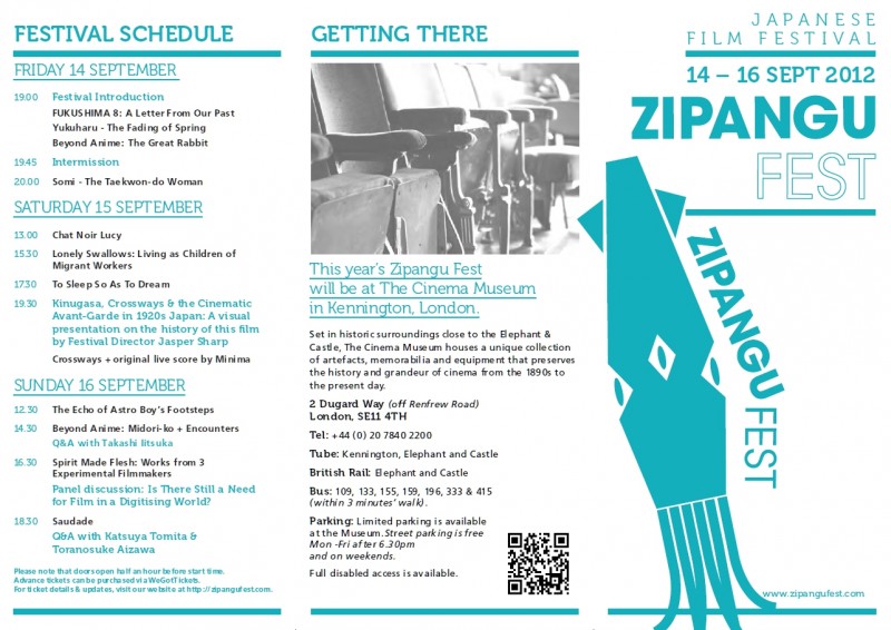
    One thing that I will definitely take into consideration is the use of the 3 step rule. This contents page delivers a great example of both what I want to create (in terms of structure), as well as aesthetics. This cover page really delivers on the portrayal and use of the three step rule (the division of the page into three). This contents page can help me identify how to structure the contents page such as, where to place the pictures/images or text.

                                       
    One reason why this contents page really captures my attention is the use of featuring other films. In my contents page I would like to feature one image from each group (in my class) and feature them in my contents page. This is very useful because when a reader views a contents page, the y would like to know what other sources of entertainment are on offer and I would like to deliver this to the reader.

                                                     
    I really like the use of small portion of text on the contents page. Everything is condensed in to what the reader 'must' know and not throwing too much information at them. I can use brief descriptions (including images) of each film on the contents page with a brief description of what each film is about. Furthermore, I like the use of a background image on the contents page as I would not like to have a plain background on mine as it will make the contents look uninteresting.

                                                           
    This contents page is full of unique ideas and creativity that is used in a very different way to what I expect.First of all, this contents page is filled with many pictures and acts like a collage of some sort which makes it all the more interesting and beautiful. This creative contents page can be used as a way to grab the readers attention due to the many images on the page and of how beautiful its appearance is. In addition, the use of having the text slanted along side the collaged images makes it more effective as it forces the reader to tilt the book and engage in what is being presented.


    Finally, this contents page has a very unique style in the way it presents its words and images. The images have been put along side the text but has been positioned in a slanted way, so that the main focus is on the text rather than the images. My intention for the contents page is for there to be images, but not to be the prime focus as the text is the most important part to the reader.

    Planning and Sketching:

    1)
    2)

    3)

    4)